Lab 3: Landscape Assessment - Connectivity

Contents
Introduction
Analysis Steps
A. Preparation for Analysis
B. Creating the Resistance Surface
C. Computing Cost Distance to Source Patch
D. Creating Least Cost Paths to the Source Patch
E. Creating a Corridor
F. Connectivity Sub-Networks
Summary
Assignment
Recordings
![]() These recordings are now outdated as ESRI has updated its connectivity-related tools. We will be doing this lab live in class.
These recordings are now outdated as ESRI has updated its connectivity-related tools. We will be doing this lab live in class. ![]()
- Connectivity Lab (1) - Overview (10:43)
- Connectivity Lab (2) - Setup and initial steps (9:54)
- Connectivity Lab (3) - Cost distance & least cost paths (24:52)
- Connectivity Lab (4) - Corridors (9:54)
- Connectivity Lab (5) - Subnetworks (15:29)
Introduction
This week we continue building our landscape patch attribute table, providing our decision makers with more data on which to base their landscape prioritization of pronghorn antelope habitat. Here we examine habitat patches not as isolated entities but as components of a larger, connected network of habitat zones.
The general notion here is this: critters such as the pronghorn aren’t necessarily restricted to areas classified as habitat. They may venture beyond these zones, perhaps wandering into “hostile” terrain to get to other habitat patches. As such, we should not limit our analyses to the resource characteristics of a single patch, but rather to the network of patches that an individual could potentially travel to, i.e., the habitat patches that are functionally connected.
In this exercise, we explore different ways of characterizing connectivity using geospatial analysis. As in other exercises, we must make certain assumptions to perform these analyses. First, we need a proper habitat patch map, which we have from the previous lab. And second, we’ll need to estimate how far a pronghorn is likely to venture outside its habitat as this will be the criteria for deciding whether a pair patches are functionally connected. This estimate can take either an Euclidean distance approach, or if data are available on how far an antelope is likely to travel in specific landscape types (e.g. across intact forest vs. open field), a cost-weighted distance approach. We will generate a cost surface dataset and use the latter approach.
With our habitat patch raster and cost surface datasets, we can evaluate connectivity within our landscape. We begin with a simple hypothetical situation where we look at the distance each habitat patch is to a single source patch. This source patch could represent a variety of things: an established pronghorn reserve, a well-known successful breeding ground for pronghorn – anything really that we’d want other patches to be linked with. Calculating the distance other patches fall from this source patch gives us one means of ranking patches in terms of connectivity.
We’ll also calculate least-cost paths (LCPs) from all patches to this central source patch. This reveals areas of non-habitat that we may want to protect based on the assumption that these areas could be pronghorn migration paths.
Noting that LCPs are somewhat restrictive (are pronghorn really that likely to locate and use the single least-costly path?), we’ll also look at how corridors are calculated in ArcGIS. While simple to execute, corridor calculations are quite CPU intensive, and we’ll be limited here to calculating a corridor between a single pair of patches. A complete corridor map would require us to calculate corridors between all pairs of patches, or about 120,000 patch pairs ( $n * (n-1)$, when $n$, in our case, is 345).
Next, we look at habitat patch subnetworks – sets of patches that are functionally connected to each other. A landscape may have a single large patch in one remote corner that might, at first, appear as the best single habitat resource available to the pronghorn, but if several smaller patches in another corner of the landscape comprise an even larger sub-network of patches, then protecting these patches may actually provide more resources for our target species. Identifying patch subnetworks allows us to visualize the landscape more accurately as resource pools, allow us to perhaps prioritize the individual patches that comprise the larger networked resource pools for conservation.
With patch subnetworks established, we can then begin to examine attributes of the subnetworks and of the patches of which they are comprised. The robustness of a patch subnetwork depends heavily on the connectivity of the patches within: some subnetworks may completely rely on a single patch to maintain interconnectivity. we’ll examine a metric called centrality that reflects the contribution of a single patch to keeping the subnetwork connected.
In the end, we’ll actually have created a dataset from which we can calculate several other connectivity metrics, but as you’ll see, we start hitting the wall of ArcGIS’ usability. For more in-depth analyses, software packages such as NetworkX (http://networkx.lanl.gov/) or CircuitScape (http://www.circuitscape.org/), are available and we will examine demonstrations in class if time permits…
Analysis Steps
A. Preparation for analysis
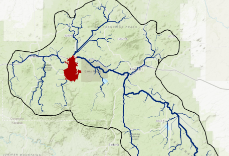
- Download the connectivity lab data (Connectivity.zip) to your class drive. In the interest of time, this zip file contains an entire workspace, complete with the standard folders, a map document with preset environment settings, and an empty toolbox. It also contains the Forest ERA Pronghorn Habitat Suitability dataset (displayed) and a copy of the habitat patch raster created in the previous lab (found in the Data folder).
B. Creating a Resistance Surface
The simplest way to calculate distances between patches would be to compute Euclidean distances from each patch. Euclidean distance, however, assumes that our antelope can wander outside its habitat with equal risk regardless of what it’s wandering into: an individual travelling through 1 km of uninhabited woodland to get to the source patch has the same chance of success as one travelling across difficult or dangerous terrain.
To reflect the notion that that pronghorn are likely to travel more easily across some areas than others, we replace Euclidean distance approach with a cost distance one. The catch here, of course, is that to do this, we need a resistance surface where cell values reflect the various costs pronghorn are likely to incur travelling across a given cell. As you can guess, these data can be very speculative – not that that will stop us, but it’s yet another factor to remember when we assemble our model.
In lecture, we discussed a few approaches to creating resistance surfaces. One is a simple recoding of a dominant overstory vegetation map into travel costs using expert-based estimates of the relative resistances that each cover type will impose on the pronghorn. A second widely used approach is to invert a habitat suitability raster. (See Beier’s Corridor Designer web site…).
Inverting a habitat suitability surface, however, can be done a few ways. One method is to divide 1 by the suitability values; this approach generates a curved relationship where resistances drop sharply as habitat suitability moves from 0 to 1 (figure below on left). Another important consideration when using this approach is that pixels with a habitat suitability of zero will have infinite cost, that is, they will be absolute barriers (and will be coded as NoData in raster datasets). This may be desirable (e.g. when roads or water bodies are impenetrable to our focal species), but it can cause problems when generating cost surfaces. A solution is to first code all zero-value pixels into a low value (e.g. 0.001) before dividing one by the values.
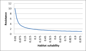
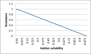
Figure 1. Relationship between resistance value and habitat suitability using different methods of inversion. The first graph represents $Resistance = 1/Habitat Suitability$; the second graph represents $Resistance = 1.0 - Habitat Suitability$.
Another method, the one recommended by Beier, is to subtract habitat suitability values by the maximum suitability value, or 1.0 in our pronghorn example. This approach generates a linear relationship between suitability and resistance (the second of the above figures). One potential issue with this approach, however, is that some pixels (those with maximum habitat suitability) will have zero resistance. While this too may be desirable, it too can cause issues when calculating cost surfaces, and some packages (e.g. Circuitscape) do not allow zero resistance surfaces. A solution to this is to assign a very low cost to zero resistance pixels.
Our cost layer will be an inverse of the Habitat Suitability values, which range from 0 (inhospitable) to 1 (happy pronghorn). We will use the second approach mentioned above to invert habitat suitability and assign a minimum cost of 0.001 to cells where habitat suitability is 1.0 (to avoid zero cost pixels).
-
Use the Minus tool (or Raster Calculator) to compute a raster that is 1 minus the pronghorn habitat suitability raster and then multiply the result (Times tool) by 100. (Multiplying values by 100 arbitrarily rescales the values from 0 to 100; the analysis would work the same if multiplied values by 1000 or didn’t multiply at all.)
-
Use the Con (or Over) tool to change all zero values in the above result to 0.001, keeping all other values as is.
→ Why do we use
0.001as the minimum value? Well, we want some non-zero value, but also something that is smaller than any existing non-zero value. Try the above procedure, setting zero values to 0.01. In the result, you’ll see some values of 0.0096. That means that our zero values (now set to 0.001) are not the least cost cells.
C. Cost Distance to a Source Patch
In this step, we’ll calculate the cost-weighted distance from each patch to a source patch. This source patch could represent an existing protected area, a noted pronghorn breeding ground, or any spatial feature to which it’s advantageous to be closer. we’ll use patch 76 – a large central patch – as our source patch in this example and calculate the least cost distance a pronghorn would have to travel to get to this patch… (![]() Note that the assignment asks you to do this for a different patch – patch 195!
Note that the assignment asks you to do this for a different patch – patch 195!![]() )
)
- Create a raster dataset from the Patch raster where only cells in Patch 76 have a value (any value), setting all other cells to NoData. This will be our source patch dataset.
- Use either the Distance Accumulation tool* to create both the cost distance and cost back link outputs from your source patch. Use the cost surface derived above by the inverting the habitat suitability layer, and use planar distances vs geodesic.
-
 Do NOT use the Cost Distance tool as shown in the recordings as the results are slightly different.
-
- Compute Zonal Statistics as Table using the habitat patches as the zones and the distance raster as the value. The minimum field in this table represents the shortest distance each habitat patch falls from the central patch. The table generated here can be easily joined to your other patch attribute table so that we may view and prioritize patches among a variety of different properties.
- → Check: Patch 10 should be
164,930cost units away from patch 76.
- → Check: Patch 10 should be
- Optionally, use the Zonal Statistics tool to create a raster of the minimum cost distance value for each patch. This result allows you to easily visualize patches by their proximity to the source patch. (Or you can just join the above Zonal Stats table to a Patch polygon dataset and symbolize accordingly.)
D. Creating Least-cost Paths to the Source Patch
Next, we’ll extract the actual least cost paths from all patches back to the source patch. ArcGIS Pro now has a tool that greatly simplifies this process: “Cost Path as Polyline”. (We could - and did - do what this tool did prior to its development, employing a creative process that took several steps and involved hydrologic tools!)
- Add the Optimal Path as Line tool (again, this is an update to what is shown in the recording), to your model. Note that this tool requires both outputs from the Cost Distance/Distance Accumulation tool. For the Path Type input, select the option that will create polyline least cost paths from each patch. Be sure that the “Create Network Paths” option is not checked as we want overlapping paths…
Examine the tool’s output in your map. Click on what looks to be a single feature and you’ll often see that a number of overlapping least cost paths are selected. This makes sense as the least cost paths from multiple sources will often take overlapping routes to the source patch. What we want to do next is merge these overlapping segments into a single segment, but one labeled with the number of least cost paths travelling through that segment. Once again, ArcGIS has just the tool we need:
- Add the Count Overlapping Features tool to your model. Set the output of the previous tool as the one and only input to the tool.
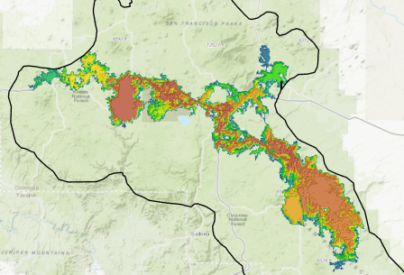
Have a look at this tool’s output. Change its symbology to graduated symbols using the COUNT_ field. Set the symbol classification to use 6 geometric intervals. Your layer should show quite clearly which routes along all the least-cost paths are [theoretically] well traveled. View the attribute table: you should see that one segment occurs within the least cost paths of 237 patches to patch #76.
E. Patch Corridors
Least-cost paths are used widely by conservationists to explore and visualize connectivity, but actual field data bears little evidence that animals truly select and use least-cost paths. So, rather than looking at the single least-cost path among patch pairs, we might want to identify a least-cost corridor of cells, i.e. all cells between two patches below a certain accumulative cost threshold.
This is done using, of all things, the “Least Cost Corridor” tool in ArcGIS, and works by simply summing up two cost distance rasters, one generated from each habitat source. (In fact, simply adding the two rasters together using ‘Plus’ tool gives the exact same result!) The resulting cell values represent the range of accumulative costs between two sources. If all cells with values less than a maximum accumulated distance (or threshold) are selected from the corridor raster, the resulting output raster will correspond to a swath (or corridor) of cells that do not exceed a specified cost. The resultant threshold output can be viewed as the least-cost corridor of cells, not the least-cost path (a single line).
Here we create a corridor between our source patch (#76) and another large patch – #156.
-
Create cost distance accumulation and cost back link rasters from patch 156. (Note: you’ll first have to create a raster where only cells in patch 156 have a value).
-
Use the Least Cost Corridor tool to compute a corridor between these two patches, setting the threshold to 300,000 accumulative cost units.
-
Remove all cells above a certain accumulative threshold, say 300,000. (Remember we’re adding cost distance values, so this is going to be quite a high number). Set the cells below this threshold to keep their original values (i.e. the result of the Corridor tool).
Your result should have continuous values ranging from the minimum cost to travel between the two patches up to our threshold of 300,000. View this layer as 5 quantiles, and you’ll see that as the values get larger, the corridor gets wider. You should also be able to view pockets of high resistance where corridors split and rejoin.
- Optionally, create a hillshade from your thresholded corridor map, tweaking the Z value to get a smooth shaded relief of your accumulated cost values. Then display this as backdrop to a slightly transparent corridor layer to give a vivid depiction of your corridor and the relative costs across the terrain.
Least-cost paths and corridors can be useful for prioritizing non-habitat areas for conservation as they indicate regions important in antelope migrations or logical places to create new habitat, but since we’re concerned with habitat prioritization, we need to refocus on the role habitat patches play in connectivity, which we’ll do shortly.
First, however, we should point out that our least-cost path and corridor analyses are limited to arbitrarily selected patches or patch pairs. What if we wanted to find the complete set of least-cost paths between all patch pairs. It turns out, this is not all that easy in ArcGIS because: (1) the tools involved are designed to work on single patches or patch pairs so upscaling this to examine all patch pairs would involve iterations; and (2) this stuff it incredibly CPU intensive – to do all patch pairs would take a l-o-n-g time.
F. Connectivity subnetworks
If we assume that a pronghorn antelope can actually wander outside its habitat, say for a distance of 30,000 cost units, before feeling exposed and uncomfortable, then we can also assume that two habitat patches within this distance of each other are functionally connected. Now our antelope can effectively wander from patch to patch to patch, as long as all the patches are within the cost threshold of 30,000. The set of patches connected by this threshold distance is termed a patch subnetwork, and the following analysis steps show us how to create that from our habitat patch layer.
Patch subnetworks can be created using Euclidean distances or cost distances (if appropriate data are available). With our cost surfaces created, we can calculate cost distances away from habitat patches and apply a threshold to determine the extent of cost-distance derived habitat patch subnetworks. The steps below outline the process to compute subnetworks for patches using a cost distance approach. This is set for the assumption that the pronghorn can successfully travel up to 30,000 cost units outside habitat.
- Use the Distance Accumulation tool to create a raster of cost distances away from [any] habitat patches.
- Use Con or Set Null tool to set all cells in the Cost Distance result with a cost above 15,000 to NoData; setting all other cells to ‘1’.
- Region group the results using the 8 neighbors. [You should get 92 total subnetworks.]
- Use the Combine tool to create a cross listing of subnetworks and the patches found in each.
The final result contains your patch subnetworks, each uniquely labeled. All patches within a given subnetwork are functionally connected, implying that a pronghorn in one patch can wander to, and use the resources of any of the other patches within the subnetwork.
Subnetworks can be useful in determining conservation value because they give us a better idea of the complete pool of resources available to individuals in a given patch. For example, a single patch with 100 ha of habitat may appear more conservation-worthy than another with only 2 ha. However, if that second patch is functionally connected to 5 other 2 ha patches, then a resident antelope actually has access to 12 ha of habitat. So pooling habitat resources among patches within a subnetwork could be a better indication of conservation value for the patches making up the subnetwork.
Calculating attributes such as the amount of habitat, of core habitat, mean shape index, etc., for each subnetwork could give us an idea of which subnetworks we might prioritize for conservation and we could tag all the patches within those subnetworks with a higher priority in our patch attribute table.
ArcGIS Pro’s Cost Connectivity tool appears to utility to this topic. However, this tool computes connectivity only to the patches nearest to it. If you have a patch just a bit further than a nearby one, this tool will compute distance via the patch in the middle and not directly to the current patch….
Summary
Landscape prioritization often focuses on the attributes of individual patches, losing sight of the fact that the distribution of patches within a landscape may be equally important. Connectivity analysis provides quantitative means of ranking patches based on their proximity to important source patches or on their membership to larger patch subnetworks, which may more accurately reflect the pool of resources available to individuals. And if we were looking at prioritizing non-habitat regions for conservation, connectivity analysis would tell us where migration routes between habitat patches are likely to occur, giving land managers information on where development should perhaps be avoided.
Connectivity analysis is currently one of the more vanguard applications of landscape prioritization. Applications of graph theory – a discipline originating from study of computer based networks – are providing us with exciting new ways (and new software approaches) to examine and quantify inter-patch relationships.
Assignment
Use the steps provided in this document to help you submit the following products. All questions should be answered patch cores and the cost surface generated in lab (the inverse habitat likelihood resistance).
Numbered items should be answered in the Connectivity_Results.xlsx Excel spreadsheet. Bulleted items should be submitted separately. All maps are to simply check your work; they should clearly show what’s being asked, but no points will be deducted for “lack of cartographic polish”.
![]() Pay attention to the details involved in each question; they may be different than those used in the lab and/or the recordings…
Pay attention to the details involved in each question; they may be different than those used in the lab and/or the recordings…![]()
- How many patches are within 100,000 cost units of Patch 195 (not including patch 195 itself)?
- Of all 345 patches, which is furthest, cost-wise, from Patch 195? How far (rounded to the nearest thousand cost unit) is this patch from Patch 195?
- Create a simple map showing the least cost paths from all patches to Patch 195 as vectors sized by how many least-cost paths are involved in that segment. Use graduated symbols, breaking your lines into 6 geometric intervals with line thicknesses ranging from 0.5 to 5 pts.
- Highlight the path segment is most heavily travelled, assuming animals follow these least cost paths.
- How many least cost paths go through the highest traffic LCP identified above?
- Create a map showing the corridor between Patch 76 and Patch 195 thresholded at 300,000 cost units. Display the corridor cost values classified into 5 quantiles. Include a legend in or along with this map.
- How many patches, including Patch 76 and 195, are included in this corridor area?
- Create a map of functionally connected patch subnetworks based on data that a pronghorn can travel up to 40,000 cost units between patches. Show the subnetwork areas as distinct colors and show the patches on top as a single color.
- How many distinct subnetworks are created under the assumption that a pronghorn can successfully travel up to 40,000 cost distance units?
- How many square km of habitat is in the largest patch subnetwork (in terms of total habitat area)?
- How many patches fall within this largest patch subnetwork?
To submit:
- Your completed Excel spreadsheet (
Connectivity_Results.xlsx) - Simple maps (these can be pasted into the Excel spreadsheet above):
- Showing least cost paths between all patches and patch 195, identifying the one path segment that appears to have the most “traffic” .
- Showing the corridor (capped at 300,000 cost units) between patch 76 and patch 195.
- Showing functionally connected patch subnetworks, assuming Pronghorn can travel successfully up to 400,000 cost units.
- Your ArcGIS Pro toolbox file (
.tbxor.atbx). Do NOT submit your entire workspace.