Lab 2: Landscape Assessment - Patch Geometry

Contents
Introduction
Background – Landscape Geometry
Overview/Assignment
Materials/Data
Deliverables
Analysis Steps
- A. Preparation for analysis
- B. Creating the Habitat and Habitat Patch datasets
- C. Using ArcGIS to calculate patch geometry metrics
- D. Calculating patch metrics using FRAGSTATS
- E. Interpreting FRAGSTATS
Recordings
- Patch Geometry Lab (1) - Intro (06:33)
- Patch Geometry Lab (2) - Creating Patches (22:00)
- Patch Geometry Lab (3) - Computing Geometries (16:02)
- Patch Geometry Lab (4) - Core Area (16:09)
- Patch Geometry Lab (5) - Disjunct Cores (11:48)
- Patch Geometry Lab (6) - Nearest Neighbor (10:23)
- Patch Geometry Lab (7) - Running Fragstats (12:31)
- Patch Geometry Lab (8) - Interpreting Fragstats (21:55)
Changes from the recording
- In calculating shape index (14:00 mark in recording 2.3 - Computing Geometries), be sure to set the field type in the “caculate field” tool to an appropriate field type. This option is new since the publishing of this recording.
- Also, in the recording on calculating core area ratio, at the 3:15 mark, I mistakenly type the query
> 0.9, when it should be>= 0.9. (Even though I state verbally to use>=!)
Landscape Prioritization
Species distribution models like the one we created in the previous exercise are often key ingredients in landscape planning as they allow us to include a species range in the prioritization of areas for conservation. It’s rare, however, that we are able to protect the entire range of a given species, so we need to ask ourselves whether some areas of a species’ range might be more worth conserving than others. The answer, of course, is yes, and we’ll spend the next few weeks looking at different ways to examine and prioritize areas within a species range for conservation.
This particular lab exercise examines properties of the habitat patches themselves: their size and shape, or geometry. In following lab exercises, we look at the configuration of habitat patches across the landscape, paying particular attention to connectivity among patches, and also habitat patches in the context of external threats. Together these habitat patch attributes can be used in developing a more informed conservation strategy, one that can be adapted to a variety of particular conservation objectives - a topic we will revisit when we examine conservation planning.
Background – Landscape Geometry
“Habitat” and “habitat patches”
The first step in any landscape prioritization exercise is parsing the landscape into discrete units that we can compare. When dealing with species ranges, a logical unit is often the habitat patch. A habitat patch is defined as a contiguous area of species habitat isolated by areas of non-habitat. Creating a spatial dataset of habitat patches therefore has two prerequisites: (1) that we have or can create a habitat map, and (2) we can isolate and uniquely label each contiguous area of habitat. That will be our first objective in this lab, using our species distribution model results as the starting point.
Landscape Geometry
Once we have our habitat patches, we will begin the prioritization by looking at geometric attributes of each patch. We can calculate a number of different, often correlated, geometric attributes for a given patch, and one of the challenges will be to pare this list to include a manageable set of ecologically relevant ones. In this lab we’ll use ways to calculate some useful landscape metrics using ArcGIS. We’ll also examine FRAGSTATS, a popular software application for calculating dozens of landscape metrics. In the end we’ll have a list of our patches and a set of landscape geometric attributes on which we can potentially rank hour species distribution area for conservation.
Overview/Assignment
In this exercise we’ll begin constructing a decision support system (DSS) for prioritizing pronghorn antelope habitat in the Western Mogollon Plateau in north-central Arizona for conservation. Specifically, we’ll be looking at individual patches of pronghorn habitat, using spatial analysis to generate a number of attributes based on patch size and shape. These attributes can, in turn, be used to rank patches in terms of conservation importance.
We will take two approaches to calculating patch geometric attributes. First we will create a set of ArcGIS geoprocessing models that calculate a number of useful attributes. And then we will examine FRAGSTATS, a popular software package that generates a bewildering amount of patch metrics. Finally we’ll compare the two outputs to see whether the two approaches agree.
This lab exercise comprises the first of three parts of a larger landscape analysis assessment for pronghorn antelope habitat in the Mogollon Plateau. In this part we focus on calculating landscape geometry metrics. Use the steps provided in this document to calculate metrics of landscape fragmentation on patches of pronghorn habitat in the Mogollon Plateau both in ArcMap and in FRAGSTATS.
Learning Objectives
- Create a habitat patch dataset from a habitat likelihood dataset along with a logistic threshold value
- Compute patch area and perimeter using ArcGIS Pro’s Zonal Geometry toolset
- Compute patch shape index using ArcGIS Pro tools
- Compute patch core area and core-area index using ArcGIS Pro tools
- Compute the number of disjunct core areas using ArcGIS Pro tools
- Compute average nearest neighbor statistics of patches in a landscape
- Create outputs required to run FRAGSTATS on the derived patch dataset
- Compute and compare FRAGSTATS patch and landscape metrics to ArcGIS derived outputs
Deliverables
The following outputs should be submitted at the end of this assignment. (Tasks 1-3 can be entered on the Excel spreadsheet available in the workspace you'll download shortly):
-
A table listing the summary statistics (min, max, mean, std. deviation) of patch area, perimeter, thickness, shape index, and core-area ratios for the set of pronghorn habitat patches within the study area. Also include columns for the same or similar measures (if they exist) from the FRAGSTATS outputs. Note: if you use Excel to calculate standard deviation, use the
StdDev.Sfunction, notStdDev.P. Or, you can compute summary statistics of a column easily in ArcGIS Pro by right clicking on a column and selectingStatistics. -
A table listing the ID of the patch(es) corresponding to the criteria listed below. Also include the metric used to identify the patch and the value of that metric (as calculated in ArcMap).
- Largest total area
- Largest core area
- Highest core:area ratio
- Most compact
-
A table listing the following:
- How many patches are made entirely of edge cells (edge = 200m)?
- How many patches have disjunct core areas?
- Which patch has the most number of disjunct core areas?
-
An X-Y scatterplot of FRAGSTATS computed perimeter-area ratio (PARA) against Shape Index, calculated in ArcGIS. Briefly describe why this is not a 1:1 relationship (i.e. why there’s more scatter in the points as it extends away from the origin).
-
A paragraph describing whether the habitat patches can be considered clustered or dispersed with backing statistics and/or graphics. What is the effect of setting the study area variable in the tool?
Materials/Data
I’ve provided a fully set up ArcGIS Pro workspace here: LandscapeGeom.zip
This workspace includes a dataset on Pronghorn Habitat Suitability developed by Northern Arizona’s Forest Ecosystem Restoration Analysis (ForestERA) program’s Mogollon Plateau landscape assessment. The original dataset, along with a shapefile of the study area is no longer on-line, but can be nabbed using the Internet Archive (which is handy tool to know…) http://web.archive.org/web/20060526063042/www.forestera.nau.edu/data_foundational.htm.
Analysis Steps
A. Preparation for analysis
-
Download the lab data (LandscapeGeom.zip) to your local drive.
-
Unzip it and open the ArcGIS Pro project.
B. Creating the Habitat and Habitat Patch datasets
Here we define habitat as those locations within the pronghorn habitat suitability map above a certain threshold. As we’ve seen in the species distribution modeling lab, techniques for choosing a threshold are determined by the method used to derive the habitat suitability map as well as the ecological application of the result. Examination of the metadata for the pronghorn habitat suitability map reveal that it is a modified rule-based map, so there is no statistically derived optimal threshold (e.g. with ROC analysis).
In cases like this, there is no inherently “correct” answer for which threshold to choose, so it’s important to: (1) be as transparent as possible in how you made your decision, (2) make use of any data made available to you, (3) understand the consequences and sensitivity of choosing a threshold that’s too low or one that’s too high. That said, for the purposes of this lab, we’ll begin by choosing a threshold probability of 0.9. The pronghorn analysis metadata does provide an accuracy assessment whereby 72% of pronghorn observations were found within areas with a suitability score of 0.9 or higher, so we at least have some indication of how reliable this threshold is…
-
Create a new geoprocessing model that will create both our habitat and habitat patch maps.
-
In this model, add tool(s) that will create an initial pronghorn habitat map by setting cells above or equal to the 0.9 probability threshold to ‘1’ and all other cells to No Data. [You should see
135,620pixels classified as habitat in the result.]Before moving on, examine the result from a critical perspective. Even though we’ve set our habitat suitability threshold to be quite high (0.9), there’s still a degree of uncertainty in our result. What is the accuracy of the input layers used to develop this model – errors temporally, spatially, and in measurement? Furthermore, from the species perspective, is a single cell, even if properly classified as habitat, meaningful?
The idea here is to recognize that our habitat map still has a bit of ‘noise’ in it. We’re going to filter out a bit of this noise by removing single or small clusters of habitat pixels. These pixels may well be accurately classified as habitat, in which case we’re increasing the false negative error in our data by removing them, but because of spatial autocorrelation, we’re assuming it’s a bit more likely that these small isolates are noise. Furthermore, from a species’ perspective, patches below a certain threshold size may be less meaningful.
The bottom line is that we're going to remove cell clusters below a certain size threshold in hopes that our subsequent analysis is more accurate and meaningful. The following steps create a set of habitat patches, each uniquely identified, for all clusters of habitat larger than ~32 HA (40 cells).
-
The RegionGroup tool isolates connected clusters of habitat cells, assigning a unique identification number to each cluster. Set the tool parameters to examine cells in all eight directions (“Queens rules”) of the given cell (vs. just four) for connectivity. [You should have
14,049classes in your result.] -
To remove cell clusters (i.e. patches) less than 40 cells, we can use the raster’s “count” attribute. Set cells in the above RegionGroup result with a count < 40 to NoData, setting all other cells to an arbitrary value.
-
Use the region group tool to this product (using 8-neighbor connectivity again) so that each patch has a sequential ID. [You should now have
345total patches.] -
Convert your habitat patches into polygons (without simplifying). Polygon features are easier to join attributes to and also have more symbology options. Be sure to select Create multipart features so that cells connected via corners remain as one feature, otherwise you will end up with more polygons than you have patches.
→ We now have our habitat patch dataset for which we will calculate patch geometric attributes…
C. Using ArcGIS to calculate patch geometry metrics
We now have our patches, so it’s time to consider what aspects of a patch’s size and shape might make it more or less valuable to conserve. It’s important to recognize that the answer may well vary widely for different species, but there are a few that are generally useful ones.
-
First, large patches are generally better than small ones, so simply calculating patch area would be a good start.
-
Second, patches with simple shapes are often considered more robust than more complex ones. This is because, among other things, a patch with a complex shape is more susceptible to fragmentation within any loss of habitat. The perimeter to area ratio is often used as a measure of patch complexity: a smaller value implies a simpler, compact shape. However, this ratio fails to correct for patch size; holding shape constant, an increase in patch size will cause a decrease in the perimeter-area ratio. Shape index is another metric that corrects for this issue as is standardizes the complexity of a shape to the most compact shape it could be, i.e. a circle – or if dealing with rasters, a square.
-
And third, we might want to assume that habitat along the edge of a patch is inferior to habitat within the patch’s core. As such, we will want to calculate the core-area ratio, that is, the ratio of core area (interior area beyond the edge) to the total area of a given patch. We, of course, have to define how wide we want our edge to be, and it has to be meaningful given the cell size of our data.
There are a number of other geometric properties we could calculate for each patch – and we’ll look at these in the FRAGSTATS portion of this lab, but these three will provide us with a quick means of ranking our habitat patches in terms of their shapes and sizes.
C1. Computing zonal geometry
Create a new geoprocessing model to hold our tools used in calculating patch area, shape index, and core-area ratio.
Use the Zonal Geometry As Table tool to generate the full suite of patch geometry attributes.
[optional] Use the Zonal Geometry tool to generate the following datasets from your habitat patch raster: (1) Area, (2) Perimeter, (3) Thickness, & (4) Centroid. These can be useful for visualization (an alternate to joining the above table to the patch polygon feature class), but the table will serve us better for what we want.
We see that the Zonal Geometry tools in ArcGIS are quite well suited to examining patch geometries. We already have one attribute we wanted to derive (patch area), and we have the key ingredients in creating another: the patch shape index.
Recall that the shape index is the ratio of the measured perimeter of a patch to the perimeter of a shape of the same area in its most compact form – i.e. a square in our case since we’re dealing with square rasters.
Thus, to calculate shape index, we begin with our shape’s area and determine what the perimeter of a square with that area would be. To do that we simply take the square root of the area (this would be the length of one side of the square) and multiply that by 4. Dividing our patch’s perimeter by this value gives us an index of shape complexity; as this value nears the value of 1, our patch’s shape is considered maximally compact. Larger values indicate a more complex shape, which may mean more susceptibility to fragmentation.
$Shape Index = {Perimeter } / ( {4 * \sqrt{Patch Area}})$
C2. Computing shape index
Add a new field to the zonal geometry table called “
ShapeIndex”. This field will hold our shape index values. (Hint: they’ll have decimals…)Set the values in this new field using the formula above to calculate Shape Index from the area and perimeter fields. (This is best done in the model builder so you can repeat your analysis, if necessary.)
In Python, the formula for this should be:
!PERIMETER! / (4 * math.sqrt(!AREA!))
We can also use raster tools to determine the core area of each patch. Here we will assume that any cell within 200 m from the patch edge is influenced by edge effects (which our pronghorn tends to avoid) and that the remaining cells are “core” cells. So, to calculate core to edge area ratio, we need to, for each patch, isolate “edge” pixels from “core” pixels and then determine the area of each. We accomplish this using Euclidean distance tools.
C3. Computing core-area ratio
Compute Euclidean distance (geodesic) from non-habitat into each patch, i.e., using non-habitat cells as the source. (Note: you’ll first have to invert your habitat or patch raster so that habitat cells are given a value of NoData; consider using the “IsNull()” tool, which is one of the few that can convert NoData cells back to values that have data. Or, you can use the original habitat probability dataset and set all values >= 0.9 as NoData…)
Compute a new raster from your Euclidean distance result such that cells within a distance of 200 are given one value (representing edge) and cells at or beyond this distance are given another (reflecting core). Tip: if you set the Habitat Patch raster to be the mask in this tool’s environment, you will be left with just pixels that are core or edge.
Tabulate the area of edge and core cells falling within each patch. (Hint: the Tabulate Area tool is handy here…) Divide the area of core by the sum of core and edge areas to get the core-area ratio for each patch.
When you exclude edge areas from habitat patches and focus only on core habitat, you’ll find that some patches have no core area. It’s also possible that removing edge pixels leaves two or more disjunct core patches. In this next step, we want to count the number of core patches occurring within each habitat patch.
To do this, we first need to isolate just the pixels that comprise core area among all the habitat patches, setting everything else to No Data. Then, you can calculate the number of disjunct cores by “region grouping” patch core areas. Selecting the “Add link field to output” option allows us to also see from which patch each core came.
C4. Computing number of disjunct cores
If you haven’t already, create a raster of just core areas (pixels >= 200m from non-habitat), setting all other pixels to the values in your habitat patch dataset. Have a look at the results: now you have a patch dataset, but all the edge pixels have been eliminated.
RegionGroup the above result to create a raster layer of disjoint core patches, again using the “Queen’s rule” of connectivity. However, this time ensure that the “Add link field to output” option is checked. Doing so will maintain the original Patch ID in the resulting dataset’s attribute table.
Use Summary Statistics to generate a count of each unique core ID having the same habitat patch ID.
Note in the above result, you likely will lose patches in your output, but that make sense! Some patches are comprised entirely of “edge” pixels, so they have no cores, let alone disjunct cores…
Lastly, we’ll examine some of the spatial statistics capacity of ArcGIS. Take a look at all the tools available in the Spatial Statistics Tools toolbox. A thorough explanation of each is available within the ArcGIS Pro Help (They’re actually quite readable and include further references…) Many of these are not applicable for our situation (a binary habitat/non-habitat analysis), but one that is somewhat useful is the Average Nearest Neighbor tool, which tells us whether habitat patches occurs in clumps or are more evenly dispersed across the landscape.
C5. Computing Average Nearest Neighbor
- Use this habitat patch polygons as the input to an Average Nearest Neighbor tool instance. Make sure that Generate Report is checked on.
- Set the Area to
8.101E09, or8101000000). (This is the area of our Study Area in map units ($m^2$).)- Run the tool and view the HTML output (likely in your scratch folder). You can use the Windows Snipping Tool to copy the window to the clipboard and then paste it into a Word document. The values it generates are also useful indicators of whether the patches are clustered or distributed. (See the ArcGIS help for full explanations of these values.)
D. Calculating patch metrics using FRAGSTATS
FRAGSTATS (https://www.fragstats.org/) computes a wide variety of landscape metrics from, among other data formats, ArcGIS GRIDs. The number of metrics FRAGSTATS can produce is staggering, and it’s a common pitfall just to run every statistic possible without first contemplating what it is you want to examine and why. We will limit the metrics we’ll produce to those similar to one’s we did using ArcGIS, mostly for comparison purposes. But really, you should be cognizant of why you are using FRAGSTATS (or ArcGIS for that matter), and use it as a means to an end, not an end itself.
FRAGSTATS may or may not be installed on the machine you are using. If it is, you can import a patch raster in ESRI’s GRID format. Otherwise, you can still use FRAGSTATS, but you'll have to convert your habitat patch raster into TIF format and import that copy. The instructions below assume FRAGSTATS is not installed on your machine. (It will still work even if it’s installed though.)
→ For this to work, however, you must download the Fragstats program here, put it on your V: drive, and expand the folder.
►In ArcGIS Pro…
- Create a folder in your workspace to hold your FRAGSTATS results. This can be in the project root folder.
- In ArcMap, create a copy of your Habitat Patch raster in TIF format. You can use the
Copy Rastertool or export your raster into TIF format directly in ArcMap. I will call mine HabPatch.tif and place it in the folder created above. - Start the Fragstats program: find & double click the frg_gui.exe file found in
V:\Fragstats4folder.
► In Fragstats…
- Create a new Fragstats project file (
File>New). - Click
Add Layerand set Input Data Type to GeoTiff grid (.tif) and select your habitat patch grid file.
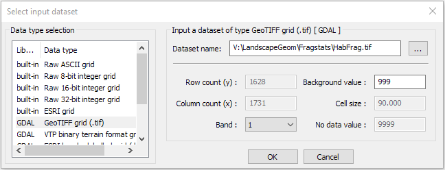
-
Set the
Edge Depthto use a fixed depth and set it a 200 m.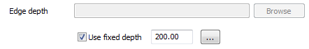
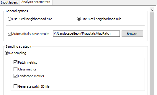
- Select the
Analysis Parameterstab. Set the neighborhood rule to use 8 cells and chose to “Automatically save results”. Save these results somewhere in your workspace. You may want to create a new folder to hold all the output files. We’ll refer to our basename as “HabPatch”. - Check Patch Metrics and Landscape Metrics in the Output Statistics. (Why would Class Metrics be inappropriate in this analysis?)
- Keep “Generate patch ID file selection” unchecked.
-
One the right hand side of the FRAGSTAS program window, you’ll see a set of tabs to set which patch metrics you want to set. Set these to create the following patch metric outputs (Just calculate the values, not any of the class level or landscape level deviation categories):
a. Area - Edge: Patch Area, Patch Perimeter
b. Shape: Perimeter-Area Ratio, Shape Index
c. Core Area: Core Area, Number of Core Areas, Core Area Index.
-
Set the program to create the following landscape metric outputs:
d. Area - Edge: Total Area, Largest Patch Index, Total Edge, Edge Density
e. Core Area: Total Core Area, Number of Disjunct Core Areas
-
Save and run your FRAGSTATS Scenario. You can view the results in the FRAGSTAST program, but we will using the exported results within ArcMap….
E. Interpreting FRAGSTATS
The patch metrics generated by FRAGSTATS, stored in a text file with the extension “.patch”, are in a CSV format, that, with a bit of editing can be imported into ArcGIS and used to symbolize our initial habitat patches. The landscape file, on the other hand, need not be imported into ArcGIS since it hold variables specific to the entire landscape, not single geographic features.
-
Rename
Run1.patchtoRun1.csvand open it in Excel. (“Run1 is the prefix I gave to my Fragstats runs…)We are going to merge these records with the patch geometry attributes generated in ArcGIS. To do this we need to edit the TYPE so that the values are numbers. So we simply have to:
-
Remove the “
cls_” from the cell values. This is easily done by replacing all occurrences of “cls_” with an empty string.- Select the entire TYPE column and hit
ctrl-H. - In the Find and Replace dialog, enter “
cls_” as the find string and leave the replace string blank. - Then click Replace All. That should do that.
Note: You may find that the PID values appear the same as the TYPE value without the “cls_”. This can be true, but isn’t always the case since PID is an internal ID value. Unless you are positive they are identical, it’s best to truncate the TYPE value as shown above.
- Select the entire TYPE column and hit
-
Save your CSV file, close Excel and then open the CSV file in ArcGIS. While you can work with CSV files directly in ArcGIS, I find converting geodatabase tables or DBF format tables more stable, so I suggest you use the
Table Selecttool (notExport Table, as shown in the recording) to save your CSV as one of these formats. -
You’ll then want to remove records with a “Type” equal to “0”, as these are non-habitat patches. Use your GIS skills to do this. (Note the methods I use in the recording are now outdated!)
-
Finally, use the Join Field tool to attach the patch attribute table generated in the first part of this lab to your Fragstats results. Join the Value field to the TYPE field. The result should have both the Fragstats and the ArcGIS generated results and you can use ArcMap (or Excel, or whatever) to compare the two.
 Note that the Join Field tool modifies the input dataset. Thus if you run it more than once, you will continue to append fields to the original PatchPoly feature class. As such, you may first want to create a copy of the feature class and join values to that; or you could simply re-run the tool that generates the feature class from the patch raster.
 -
Create some scatter plots of ArcGIS derived results vs. Fragstats. Which correspond to each other?
-
Open the Run1.land in a text editor. The values apply to the entire landscape and allow you to compare different landscape configurations. (For example, if you had a historical or climate-projected landscape scenario…)
Summary
Parsing the output of a species distribution model into habitat patches allows us to identify not only where a species of interest may occur within a landscape, but which of those spots may be more valuable in conserving the species. Patch geometry is just one of many important factors that can go into prioritizing a landscape for conservation, and in the coming weeks we’ll examine several others.
Additional Tips:
Plotting scatterplots in ArcGIS
- Add the table to an ArcGIS Pro Map, if it’s not there already.
- Right-click the table and select
Create Chart>Scatter Plot; this should open the Chart Properties window. - Select your X and Y values to plot (e.g.
ShapeIdx, from ArcGIS, andPARA, from Fragstats) - Explore the other options available to modify the layout of the scatterplot.
- In particular, if the table you selected is the attribute of a feature class, you can select items in the chart, and the corresponding feature will also be highlighted.
- Once finished, you can save your graph by exporting it to a JPEG or other graphics format.