Lab 4: Landscape Assessment - Threat Assessment

Contents
Introduction
Overview/Objectives
Materials/Data
Products
Threat Analysis 1 - Proximity
Proximity to developed areas
Proximity to transmission lines
Threat Analysis 2 - Density
Synthesis of Results
Approach 1: Weighted overlay
Approach 2: Ranked patches
Summary
Assignment
Recordings
- Threats (1) - Intro & Euclidean Distances (16:59)
- Swap Distance Accumulation tool for Euclidean distance
- Be sure to use the geodesic, not planar method
- Max distance in result is
35,473m, not35,492m
- Threats (2) - Decayed distances (13:04)
- Again, swap Distance Accumulation tool for Euclidean distance, being sure to use the geodesic method
- The low end of the decayed distance is no
3.18627e-30
- Threats (3) - Threat densities (21:11)
- At 18:21, the recording mentions the Line Density tool, when really we want to run Kernel Density applied to a line dataset (roads).
- At 20:34, the slide deck displays a max developed density w/in 3km of
63.2%, when it should be64.4%.
- Threats (4) - Synthesis with weighted overlay (17:09)
- Threats (5) - Patch attribution (11:14)
Introduction
We’ve already introduced the concept of landscape prioritization and examined how metrics based on the size, shape, and connectivity may be used to prioritize patches for conservation. Today, we look at another approach to ranking areas for conservation – this time dealing with how viable habitat may be given its proximity and sensitivity to various sources of stress.
While assumptions and generalizations occur in all of the prioritization exercises we will be doing, threat mapping involves an exceptionally large degree of expert opinion and hypothesizing. In many cases, the knowledge required to adequately assess the level of threat to habitat simply is not available. This is partly due to the fact that identifying threats requires us to project into the future: we’re predicting what might happen in one location given its proximity to what’s going on in nearby locations. Compounding this is the fact that predicting these changes often involves modeling human behavior, something that’s not that easily understood.
These complications haven’t stopped others from producing threat maps, and it won’t stop us either. However, rather than claim we’re providing you with the “be-all, end-all definitive guide to threat mapping,” we’re going to focus this exercise on exploring different geographic modeling approaches to mapping threats. The hope here is that when more scientific understanding becomes available regarding how landscapes are likely to change and how these changes affect species, we can quickly model this information into maps that accurately reflect how threats might propagate across a landscape and into our habitat patches.
We begin by exploring different ways to express and visualize threats in a landscape. Here, we construct a weighted overlay map that combines stresses into a compelling, though somewhat generalized representation of treats in the landscape. We also consider using a zonal stats approach that produces a less striking result, but one that preserves much of the original data.
While the spatial features on which we base our threat analysis are real, I again want to emphasize that the actual scope and magnitude of the stress they inflict on our pronghorn is completely fabricated. Such information for the pronghorn does not exist (to my knowledge), but I didn’t want that to stop us from exploring the various spatial analysis methods for mapping threat scope and severity.
Overview/Objectives
The analytical techniques we explore in this lab relating to threat mapping are fourfold:
-
First, we examine ways to map proximity to a stressor. Here we use familiar Euclidean distance analysis, but we also learn how to transform distance values when the impact of a stress decays exponentially with distance from the source.
-
Second, we explore various ways to measure the density of stress sources. We examine both vector and raster-based techniques to measure the density of points, lines, and pixels, using both weighted and non-weighted techniques.
-
Third, we apply a method for projecting the spatial expansion of a threat when the likelihood or rate of growth might vary across various locations in the landscape.
-
And finally, we examine techniques for combining individual threat maps using both the weighted overlay tool and a zonal statistics approach.
Materials/Data
For this exercise, you’ll continue working with our pronghorn habitat patches. Several of the input datasets, including some compiled threat maps, have been created for you. Models used to create these data from available sources are provided in the Data prep tools toolbox. Download the materials here.
-
The 2011 NLCD for the study area. This dataset was extracted from ESRI’s landscape layer service, resampled to 90m, and projected from its native Web Mercator projection to the UTM Zone 17 coordinate system used in previous exercises. (See the Extract and Resample NLCD 2006 model.)
-
A subset of the Geographic Names Information Service (GNIS) data points for Arizona (source: http://agic.az.gov/portal). While the GNIS dataset includes many feature types (see http://geonames.usgs.gov/pls/gnispublic/f?p=gnispq:8:3049633479931480), these points comprise only those related to human activity and have been spatially subset to the Mogollon Plateau study region. A set of hypothetical magnitudes of impact for each class has been joined to the data for the purposes of this exercise. (See the Extract human related GNIS points model.)
-
Arizona power transmission lines (source: 2010 TIGER dataset via http://sagemap.wr.usgs.gov/; scale: 1:100,000:).
-
USA Roads. Source: ESRI’s Landscape Layers; scale: 1:100,000). These data were retrieved and subset for the Mogollon Plateau study area using ESRI’s landscape toolkit - http://esri.maps.arcgis.com/home/item.html?id=06f9e2f5f7ee4efcae283ea389bded15). (See the Extract ESRI Roads model.)
-
Classified overlay rasters. These two rasters in the Overlay folder represent threat classes for human impact densities and road densities. They will be used towards the end of this exercise.
Products
From these data we will calculate the following threat-related layers:
-
Euclidean distance from developed areas.
-
Exponentially decayed Euclidean distance from transmission lines.
-
Density of GNIS human impact points within a 5km radius (point density, kernel density, and weighted kernel density).
-
Kernel density of roads using a 3 km radius.
-
Focal density of developed areas.
-
Weighed overlay of distance to developed, kernel density of human points, and kernel density of roads.
-
Patch zonal statistics of distance to developed, kernel density of human points, and kernel density of roads.
Threat Analysis 1: Proximity
A great number of threat maps used in conservation use very simple tactics to map potential threats across a landscape, and one of the most simple and straightforward is straight-line (i.e. Euclidean) distance from where humans are or are likely to be. The underlying concept here is simple: the closer habitat is to human activities/disturbance, the more likely it is to be adversely affected by it.
In this analysis we will examine a few different ways to evaluate and express threats in terms of proximity to a stress. We will base our Euclidean distance analysis on the following [hypothetical] findings:
-
“Pronghorn generally don’t like to wander in or near developed areas. A recent study noted that the pronghorn will outright avoid developed areas and are only seldom seen in viable habitat areas within 1 km of developed areas. Areas within 1-2.5 km are somewhat stressful to the antelope and less so in areas 2.5 to 5km from developed areas. Beyond 5km, developed areas have no impact.”
-
“Pronghorn antelope are stressed out by the magnetic fields generated by transmission lines. The magnetic fields are strongest directly under the transmission lines but the field strength (and effect on the antelope) decays exponentially. At 1200 meters away, the impacts are negligible (about 0.1% of original strength).”
Both analyses begin with calculating Euclidean distance from their respective source. From there, the distance to developed result is reclassified in to 5 impact zones, 4 being the highest impact (i.e. 0 m from developed) down to 0 (> 5km from developed). The threats from the transmission lines, however, require transforming the distance from line values to a distance-decayed value using an exponential decay function.
The steps below provide detail on how to calculate these products…
A. Proximity to Developed Areas
- First, to calculate distance from developed land, we’ll need a raster layer containing pixels of developed areas only, with all other pixels set to NoData. Use the 90 meter NLCD dataset to create this.
- Calculate Euclidean distance (geodesic) from developed land.
This result is our first threat map; each cell indicates the proximity to the source of stress (developed land). However, we are provided additional information that breaks these distances into 5 categories of threat magnitude. Well apply this information by reclassifying our continuous data into classes.
- Reclassify the output generated above into the 5 impact zones. Set breaks at 0, 1000, 2500, 5000 and the maximum value of the Euclidean distance raster. Reclassify these zones into values from highest (4) to lowest (0):
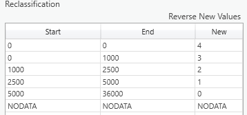
This produces a map typical of many threat maps. Cells with a value of 4 represent the most intensely threatened areas while cells with a value of 0 have little or no impact on the pronghorn.
B. Proximity to Transmission lines
This analysis is similar to the one above, except that the magnitude of the stress decays exponentially from the source. The information provided by the hypothetical study can be visualized with the following:
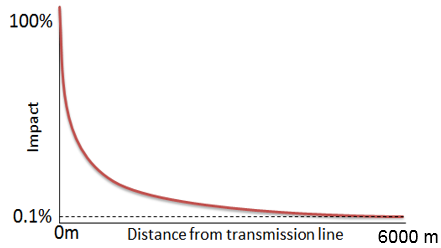
Directly under the transmission lines, pronghorn feel the full impact of the lines. The impact drops dramatically (exponentially) until at 6000m only 0.1% of the original impact is felt. What we need to do is create a map where the pixel values conform to this exponential decay function, and we do this by applying the decay function to the Euclidean distance values as described in the steps below.
- Start by creating a raster of Euclidean distances (geodesic) from the AZ Transmission Lines dataset.
The next step is to apply the exponential decay function to the linear distance above so that the resulting cell values show a more pronounced (i.e. exponential) decrease in influence as we travel further from the transmission lines. The exponential decay function is:
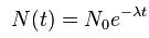
Where $N(t)$ is the magnitude of impact at distance $(t)$, calculated as the magnitude at the source times the exponent of distance $(t)$times a decay rate ($\lambda$) multiplied by $-1$ (to reflect decay, not growth). We can determine ($-\lambda$) using the information provided: at 6000 m, the magnitude is 0.1% of the initial magnitude. So, $t = 6000$ and $N(t ) = 0.001$, and we can solve for ($-\lambda$). (See LINK for a good example.)
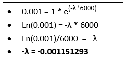
With the decay coefficient known, we can apply the function to the Euclidean distance functions via the Raster Calculator:
Decayed Impact Raster = Exp(-0.001151293 * Euclidean Distance Raster)
- Compute the Decayed Impact Raster using the formula above. Examine the output. You may want to play with different impact distances (e.g. change 6000 to 1500 or 15000) and see how the output changes. Another approach is to use the Rescale by Function tool. This tool offers many more approaches to transform linear values…
Threat Analysis 2: Density
Another approach to quantifying threat is to look beyond the proximity to a single instance of a threat and look at the number of threats within a given distance of the patch. Here we look at three different means of spatially modeling threat density: point density, kernel density, and neighborhood analyses. The first two are appropriate for vector data and the last is used with raster data.
First, we’ll construct a map showing the density of locations of known human impact. We’ll compute this result two ways: via the point density tool and the kernel density tool – and examine the relevant differences among the two methods. We’ll then re-run the kernel density tool using weights representing how much the different types of human impacts can accumulate…
-
Create a new geoprocessing model to process our threat density analyses.
-
Use the Point Density tool to calculate the number of GNIS points/km$^2$ within a 5 km radius of a given pixel.
-
Use the Kernel Density tool to calculate the density of GNIS points, again using a 5 km radius, and compare the result with that of the Point Density analysis. Here, we’ll treat each selected GNIS point as a single instance of human activity by setting the Population field to none.
-
Now we’ll examine the effects of weighting the magnitude of the points in the kernel density calculation. If you examine the GNIS points attribute table, you’ll notice the last column indicated the [hypothetical] magnitude of threat that a point has, given what the point represents. Add another instance of the kernel density tool and set it just as you did above, except this time set the population field to the magnitude field.
-
Use the Kernel Density tool again to calculate the density of roads (radius = 3 km). Do not use a population field. Here we see that the kernel density tool can be applied to linear features as well. (Measures here will have to be planar, not geodesic as geodesic measure are not supported with line features…)
The above tools apply to stresses represented by vector data, specifically point and line features. Examine the differences between the three methods applied to the GNIS points. Consult the help associated with each tool to be sure you understand how each is calculated – ask an instructor/TA if you remain unclear.
Next, we’ll examine how you can calculate threat density layers if your threats are represented as an area, i.e. a class of pixels in a raster dataset. (If you have a polygon dataset, you’ll simply need to convert it to raster to use this technique). In this example, we’ll calculate, for each location in the study area, the percentage of developed cells that fall within a given radius it. It’s a straightforward application of focal statistics.
- Create a binary raster where developed cells from the NLCD 2011 layer have a value of ‘1’ and other cells are ‘0’.
- Use the Focal Statistics tool to determine the proportion of developed cells within a 3 km radius of a given cell. This would be the focal mean value since all the developed cells have a value of ‘1’ and all other cells have a value of ‘0’.
Examine the results. (Computing hillshade maps from these density surfaces - exaggerating the z-values by a factor of, say, 1000 - really enhances the visual effect…) Notice that the point distance tool results in a simple count of the number of features within the specified distance while the kernel distance tool weights a feature’s impact higher if it is closer. The focal statistics approach is useful when the threats are mapped as areas rather than points or lines but does not consider proximity other than as a threshold distance.
Synthesis of results
We now have created several proxies of threat and need to synthesize these results into a way that enables us to prioritize our habitat patches in a meaningful way. A popular approach to doing this involves merging the individual threat maps to create a single, indexed threat map. This approach is what’s often displayed in maps showing the extent of human influence across landscapes, regions, and the entire globe (e.g. the Wildlife Conservation Society’s Human Footprint and Human Influence Index datasets, Halpern et al’s Global Map to Marine Ecosystems).
These cumulative impact or threat maps usually involve a weighted sum or weighted overlay of individual threat components. Both approaches allow us to assign weights to the individual components, allowing us to adjust the relative importance one component has over another. A weighted sum simply multiplies the values of a particular threat component by its weight and then adds all weighted components together. This approach (and tool) is appropriate when the values of each threat component share a similar numeric scale and range; if not then the weighted overlay tool should be used.
A weighted overlay differs from a weighted sum in that the inputs are scaled prior to combining them. This scaling is required so that each threat component shares a common evaluation scale. The weighted overlay is appropriate in our case since our threat component values include multiple numeric scales and ranges: distance to developed land is in meters, density of roads is in meters/km$^2$, etc. Scaling values involves compressing (or possibly stretching) the range of values and defining how original values are assigned into those ranges.
ArcMap’s weighted overlay tool does just this. However, there is one important catch in that it requires the input rasters to be integer rasters and many of our threat layers are floating point. We could just convert these layers to integer layers, but the tool becomes unwieldy if we have more than about 10 classes. So… before getting to the weighted overlay tool, we are going to reclassify our threat components prior to executing a weighted overlay.
We’ll examine the execution of the weighted overlay in ArcMap with the following example.
Approach 1: Weighted overlay
Our team has decided to create a synthesized threat map depicting the combined threats of:
(1) Density of human conflict points
(2) Density of roads, and
(3) Proximity to developed land
This map will indicate five levels of threat - level 1 being little or no threat and level 5 being extreme threat. Furthermore, the threat from proximity to developed is considered to be three times as important as the other two threats.
As just mentioned above, the first step in performing a weighed overlay is to reclassify any continuous rasters into a manageable number of discrete classes. The weighted overlay tool can accept any integer raster, but if you have more than about 10 classes, the tool will become quite unwieldy. To save time, I’ve provided 2 of the 3 rasters to be you’ll use: The GNISdensity and RoadDensity raster datasets in the Overlay folder represent reclassifications of the Human Conflict Kernel Density and TIGER Road kernel density rasters, respectively. The GNIS density surface has been grouped into 9 classes and the road density into 5 classes. These will be combined with the proximity to developed, consisting of 5 classes, which you created in Step 3 of Analysis 1 above.
The remaining steps involve rescaling these rasters so that they share a common number of threat levels – in our case 5 as that what was decided above – and then assigning weights to the individual components. All this is done relatively simply in the Weighed Overlay tool. .
-
Add the
GNISDensityClasses.imgandRoadDensityClasses.imgdatasets (in the Overlay folder) to your map. The high values in these rasters indicate high levels of stress from their respective source. Note how many classes each contains. -
Create a new geoprocessing tool to hold our threat synthesis analyses.
-
Add the Weighted Overlay tool and link the rasters indicated above to it.
-
Link the two rasters added in step mentioned above to the tool. Also link the layer representing the threat classes calculated from proximity to developed areas to the weighted overlay tool (the result from Analysis 1, Step 3).
-
Set the Evaluation scale to
1 to 5, since we want to end up with 5 distinct threat classes. -
First, we’ll rescale the input values to match our output threat values. To do this we need to compress any input layers that have more than 5 classes into 5 classes and/or expand any threat classes that have fewer into 5 classes. As it turns out, two of our three input layers already have 5 classes, so we don’t have to rescale those. However, we do need to compress the 9 GNIS density classes into 5. How you compress 9 classes into 5 can have an impact in your result, so you’ll need to decide carefully - and ideally with consultation with experts. In our case however, we’ll use the following reclassification:
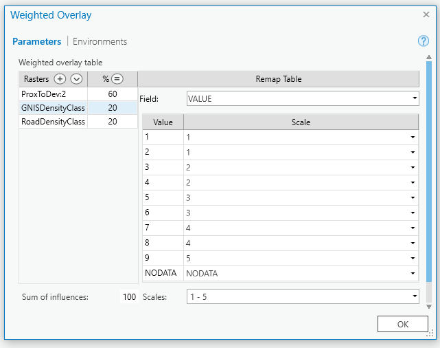
For the other two rasters, double check that the scale values match the field values. For the proximity to developed threat, you’ll have to adjust your values from 0-4 to 1-5.
-
Next, we’ll set the percent influence so that the development threat
% influenceto 60%. Set the% influenceof the other two (road density and road GNIS density) to 20% each. The total % will add to 100% and the development threat will be 3 times as much as the roads and road crossings. -
Lastly, in the environment variables for the weighted overlay tool, set the mask to be the Mogollon Plateau boundary shapefile (“studyarea.shp”). This will limit your output to the study area boundary.
-
Run the tool and view the output. (Note that the default color scheme suggests that low values have a high threat and vice-versa. You may want to flip it or chose a different scheme…)
- Open the attribute table for the resulting raster. Add a column and compute the areas of each threat category in $km^2$ from the cell counts.
The resulting map represents areas of high combined threat (5) to areas relatively free from threat (1). These maps are simple to read and interpret, but they hide an impressive amount of assumptions. Are development threats really 3 times as dire as road threats? And what about our classifications? Is a pixel that is 999 m away from a developed area actually significantly more threatened than one that is 1002 m?
Regardless, these maps remain quite popular and can be an effective communication device when presented properly (i.e. within their full context). And one way of using them in our landscape prioritization is simply to calculate zonal statistics on each patch to find the mean threat value. Those patches with a high threat value may be less likely to persist and we may want to lower their overall rank for conservation. Or we may want to enhance their rank since are in more need of protection…
Approach 2: Ranked patches
A second approach to assigning threat ranks to patches, and one that doesn’t bury assumptions nearly as deep, is simply to perform zonal stats on each patch using the original continuous threat value calculated using the Euclidean, density, or cost distance analysis. What remains is a far less digested account of the threats to each patch, but this, as we’ll see in later exercises, allows us a much more flexible and powerful decision support tool. (Well, all we’re really doing is postponing the ranking decisions, but in the end this should enable a much more robust decision support system.)
One factor we should consider before performing our zonal stats is which zonal statistic is the most meaningful? Certainly the mean value is useful as it gives a good approximation of the overall threat to a given patch. However, the minimum value may be a useful indicator of the highest threat to a patch since it may reflect the closest point to a road crossing, developed area, etc. Range and standard deviation also give us information about how the patch aligns with the threat surface.
-
Calculate zonal stat tables on the following threat variables (using the habitat patches as the zones):
a. Euclidean distance from developed areas
b. Decayed distance from transmission lines
c. Weighted kernel density from GNIS points
d. Road kernel density
-
Cull the stats that are not meaningful from the table. The zonal means will often be good general descriptors of the level of threat, but in some cases the minimum value will also be revealing: what is the shortest distance from a patch to the nearest road? Measures of variance (e.g. standard deviation) can also be useful in describing a patches overall susceptibility to threats.
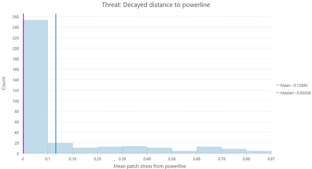
You can produce useful figures summarizing these zonal stats products by right clicking on the stat field header in the table and selecting Statistics, which will produce a histogram of values along with a line showing the mean value. In the Chart Properties dialog box that appears, you can adjust properties such as the number of bins and what other summary statistics to show. You can also, by selecting the General tab, change the chart’s title and x-axis label…
- Create histograms for your 4 variables (the Zonal Mean products), setting them to display values in 10 bins, and adding the mean and median values to the display. Be sure each graph is named appropriately.
- To create a histogram from a table, right click the table and select
Create Chart>Histogram
- To create a histogram from a table, right click the table and select
Summary
Rather than walking away from this exercise feeling you can apply a general spatial model to map threats in any landscape, you should instead leave with a greater appreciation of the generalities of many threat models and the sophisticated data demands of others. Proper threat mapping requires an intimate knowledge of the mechanisms of change within a landscape. And when those data are available, the techniques demonstrated in this exercise should enable you to capitalize on them. However, more than likely those data are not available, and you may find yourself using simple Euclidean distance techniques. If that gives you a better means for prioritizing the landscape, then you should consider using them, but always be wary of the assumptions you’re making and the implications they may have in your final landscape assessment.
Assignment
-
Create a new MS Word Document named
<netID>_ThreatLab.docx(replacing<netID>with your Duke NetID). After adding the products below to this Word document, submit it to Canvas. -
WEIGHTED THREAT MAP (End product of “Approach 1: Weighted Overlay”):
Submit your weighted threat map showing the result of your weighted overlay clipped to the boundary of the Mogollon Plateau study area, along with a table listing the total area (in km$^2$) of each threat zone (1 thru 5) found within the Mogollon Plateau study area. (You can simply use the Windows Snipping Tool to copy and paste screen grabs of each into your Word document.) Be sure you’ve created a column to list areas in $km^2$! -
HABITAT PATCH ZONAL STATS (End product of “Approach 2: Ranking patches…”):
Add screen captures of each of the 4 summary stat plots of zonal mean threats to your word document. Be sure that each shows the histogram with 10 bins, is appropriately titled, and includes both the mean and median values in the plots. An example plot for minimum decayed distance to transmission line is offered below…
- MODELS
Tidy your geoprocessing models and submit images of them in your document. Please ensure they are understandable.