Habitat Modeling - Part 4: Model Evaluation
Table of Contents
Recordings
- Proj 3.4.1 - Generating Pseudoabsences (20:20)
- Proj 3.4.2 - Constructing a confusion table (15:49)
- Proj 3.4.3 - Examining misclasses (14:48)
Overview
So far, we’ve run two habitat analyses for our pigmy salamander. The first was a rule-based analysis in which we applied expert knowledge to identify a set of pixels that meet the requirements of “habitat” for the pigmy salamander. In the other, we used maximum entropy, a model which uses species presence data to identify patterns in the distribution of values pulled from environmental layers at these locations to assign a score to each pixel that reflects the likelihood that that pixel is habitat.
In this continuation of the habitat modeling exercise we examine our modeling results. First, we examine ways the various models can be tuned and validated. Did we perhaps include too much habitat in our result? Too little? How can we tell? And second, we step back and look not at how well our model might have performed, but instead focus in on where the model did not perform well. Why might we see a salamander in a place where we did not expect based on our model? Or conversely, why are there no salamanders in a place where there is perfectly good habitat?
Objective 4.1: Model Tuning
Ultimately, we want to produce a map displaying where pigmy salamander habitat is and is not, i.e.. a binary map with one value for habitat and another value for non-habitat. The rule based approach generates this automatically. However, for the MaxEnt product (as well as many other statistics-based models), we must select a probability threshold above which we classify as habitat and below which call non-habitat. Choosing what threshold to use is not an arbitrary process: if we choose a low threshold then we are likely to include places in our habitat map that aren’t really suitable for salamanders; but if we chose a high threshold then we are likely omitting areas that are perfectly fine four our salamanders.
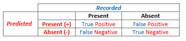
Deciding on a threshold, often termed as model tuning, is the first objective of this exercise. Tuning a model requires species presence data and ideally species absence data. However, as true absence data are usually not available, we create pseudo-absence data which are simply a random grab of points within the extent of our analysis that we assume do not fall in habitat. With presence and absence data and a modeled habitat map, we can evaluate our map by generating a confusion matrix. To do this we simply overlay our known salamander occurrences and [pseudo]absences on top of our predicted habitat map to categorize each point into one of four categories: true positive (a recorded occurrence falls on a predicted habitat cell), false positive (recorded [pseudo]absence falls on a predicted habitat cell), true negative (recorded [pseudo]absence does not fall on a predicted habitat cell), and a false negative, (recorded presence does not fall on a predicted habitat cell). [It may help to remember that the true and false refer to whether the prediction was accurate or not…]
Each probability threshold selected will have a potentially different set of confusion matrix values since the area of predicted habitat changes with a given threshold value. Tuning a model refers to changing the threshold and seeing how it effects these numbers.
A model can be tuned to ensure that all observed presence points fall within predicted habitat by lowering the probability threshold for classifying a pixel as habitat. Set the threshold to zero and the entire landscape becomes classified as habitat and all your positives (recorded presences) will be true positives. This is termed a maximally sensitive model, since the model is sensitive to all possible species presences and will include them in the result.
Of course, increasing a model’s sensitivity will also increase your false positive rate (i.e. classifying habitat where there aren’t really any individuals). If you want to avoid false positives, you’d increase your probability threshold so that only the cells most resembling habitat in your model get classified as habitat. This is referred to as increasing your models specificity as the predicted habitat is a much more specific portion of the landscape. Of course, increasing a model’s specificity will increase the rate of false negatives, that is, of excluding actual habitat areas in your modeled result.
One goal of model tuning is to find a balance between model sensitivity and model specificity. This is often using the Receiver Operating Characteristic or ROC curve approach. These curves are developed by generating the confusion matrices for a sequence of probability thresholds and then plotting the rate of true positives to the rate of false positives for each of the probability thresholds. If the model was poor, in which case habitat pixels were scattered randomly across [geographic and parameter] space, you’d get a steady increase of both false positives and true positives as you lowered your probability threshold (and classified more landscape as habitat). If your model was successful in discriminating habitat from non-habitat, the rate of true positives would increase much more quickly than the rate of false positives as you lowered your threshold and you’d see a large arc deviating away from the line generated from a “random guess”. The probability threshold at which the curve deviates most from the “guessing line” represents the best balance between model specificity and sensitivity.
The steps below outline the procedure for generating pseudo-absence points and creating a confusion matrix for the threshold we chose based on the MaxEnt analysis. These steps are also quite useful for analyzing other statistics-based model output (e.g. GLM, GAMs).
Step 4.1.1. Creating a pseudo-absence points
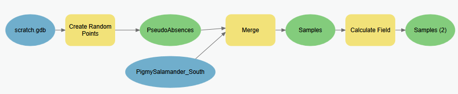
Follow these steps to create a point feature class (called Samples.shp) which includes our known salamander locations and a set of locations we are assuming the salamanders do not exist [pseudo-absences]. The workflow logic here is to create a set of random points within the same extent of our known salamander locations, then append the known locations to this feature class, but then we also need to set an attribute value that allows us to easily identify the observed locations apart from the pseudo-absence locations.
-
Create a new geoprocessing model (e.g. “Create pseudo absence points”)
- Add the Create Random Points tool. Set it to create random points within the extent of the salamander observation points shapefile (
PigmySalamanders_South.shp) and to create the same number of absence points as the salamander observations. Finally, set the points to be created at least 500 m from each other so that the points aren’t clustered. Name the output PseudoAbsences in your Scratch geodatabase.OPTIONAL: In the environment settings of the Create Random Points tool, you’ll see properties for the Random Number Generator. Here if you set the seed to
761(keeping the Generator set toACM collected algorithm 599) , you’ll get the same random values that I get. However, MaxEnt also has a randomness to it, so your overall confusion matrix may be different… - Add the Merge tool to your model and use it to combine the newly created pseudo absence points with the original salamander observation points into a single feature class. Name the output Samples in your Scratch geodatabase.
*Have a look at the output’s attribute table. Can you discern which are the actual observation points from the pseudo-absence points? We’ll need to assign some value in the attribute table to enable us to do so. To accomplish this, we’ll add a field and set it’s value to 1 or 0 based on whether it’s an observation or pseudo-absence point, respectively. We can use the values in the attribute table to compute the correct value.
- Use the Calculate Field tool to add a new calculated field. Set the new field name to be Observed, and set the expression to be:
!Species! == "S Pigmy Salamander" - Optionally, use the Delete Field to remove all other fields from your Samples feature class.
Add the result to your map and symbolize the data so that the different ID values are different symbols. The 1’s represent observed salamander presence and the others are your pseudo-absence points. We can use these locations as samples to generate a confusion matrix.
Model for creating pseudo-absences…
Step 4.1.2. Generating a confusion matrix from sample points
Now that we have our known salamander presence and [pseudo]absence locations, we can evaluate how well our model did in terms of sensitivity and specificity. The point shape file we just created above represents our observations, and what we need to do now is link our predictions with these observations, and with that we can tally our true positives/negatives and our false positives/negatives…
-
Create a new geoprocessing model (e.g. “Create confusion matrix”).
- Add the Extract Values to Points tool and use it to extract the values from your MaxEnt habitat probability map (the continuous, not the binary one) for the locations of your presence/absence points created in the previous step.
Add the result to your map and look at the attribute values. The field
Idremains from your previous step; here a 1 is an observed presence and a 0 is a [pseudo]absence. The new field (RASTERVALU) lists the Maxent predicted habitat likelihood at that location. - Using the Calculate Field tool, create a new field named
Predictedto this attribute table and compute all values below your MaxEnt “Balance training omission, predicted area and threshold value” to zero and those above to 1 (just as we did to produce the binary raster).→ TIP: You can use the calculator expression:
[RASTERVALU] > 0.030)to assign 1’s and 0s (replacing0.030with the threshold you got…) -
View and sort this table on the
RASTERVALUattribute. If your MaxEnt model predictions were absolutely correct, you would see all zeros in the Id column (i.e. observed presence/absence) sort perfectly with the crossover between zeros and ones occurring right at your chosen threshold. However, chances are that you don’t see this; instead we see classification errors. - Add the Summary Statistics tool to your model; we’ll use this to summarize the results above into a table listing how many points fall into each of the four confusion matrix sectors. Set the Statistics field to be the
COUNTof theOBJECTID(or any other) field. For the case field, select both the Observed and Predicted fields.Model for creating a confusion matrix from a habitat probability raster
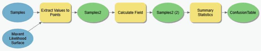
- View the output of the Summary Statistics tool. It’s not the same format as the confusion matrices discussed above or in class, but the information is there.
- The row with an
Observedvalue = 1 and aPredicted= 1 are the true positives.
(We found a salamander where we predicted to. )
) - The row with an
Observedvalue = 0 and aPredicted= 1 are the false positives.
(We didn’t find a salamander where we predicted to. )
) - The row with an
Observedvalue = 0 and aPredicted= 0 (or -9999) are the true negatives
(No salamander was found at the location where we didn’t expect to find one ) - The row with an
Observedvalue = 1 and aPredicted= 0 (or -9999) are the false negatives
(A salamander was observed in a location where we didn’t expect to find it. )
Note that you may not actually get values for all 4 categories; MaxEnt tends to predict high habitat likelihoods where supplied presence points occur, causing false negatives to be very infrequent. If you have a large number of presence records, you should omit a few in creating your MaxEnt model and reserve them to use here to get a more reliable show of false negatives.
- The row with an
Confusion matrices give us a useful indication of how sensitive or specific a particular threshold is and how well the model works. You can calculate the “percent true” by summing the “true” occurrences (true positives and true negatives) and dividing that sum by the total number of presence/absence points used in creating the confusion matrix. Related to this, but slightly more complex is the kappa statistic. (See a statistics text book or this link to find how it’s calculated). A higher kappa statistic reflects better agreement between what's observed and what’s predicted, i.e. a better model.
However, it’s often the AUC or “Area Under the [ROC] Curve” that’s used to assess the overall quality of a habitat model. Determining the AUC begins with developing the ROC curve, which as described above, is a matter of plotting true positives against true negatives for a series of probability thresholds. The AUC is simply the area between that curve and the guessing line. A higher value indicates a better model.
Several statistics packages can calculate ROC and AUC for a set of presence/absence points tagged with modeled habitat likelihood values. (“ROCR” is one that is popular in ‘R’.) It’s therefore overkill to try this in ArcGIS (though you could do it through repeating the steps above…). However, it may be useful, depending on your overall objective, to calculate the confusion matrices from a range of probability thresholds, i.e., ones that reflect conservative or liberal interpretations of your habitat likelihood values.
Before moving on, it is important to note that confusion matrices should ideally be created with a data set that is independent from the presence and [pseudo]absence points used to develop the model.] Collecting presence and absence data, however, is a challenging task and more often than not (particularly for rare and/or endangered species) these data are quite sparse. Consequently, it’s quite common, though still discouraged, to use the same dataset for both. There are statistical implications for this – as well as methods to overcome these implications; if you do not understand these fully yourself, you should consult a statistician.
Objective 4.2: Model Interpretation
Model tuning allows us to tweak probability thresholds so that we may generate binary habitat maps from a probability surface that reflect various priorities (increased sensitivity, specificity or a balance of the two). The confusion matrices developed by overlaying known presence and absence data on top of binary prediction models also provide a means for validating our model. You could stop there – with a binary map showing where you are likely to find the species along with some measure of how confident you are in that prediction, but if you did you’d be overlooking some potentially useful and interesting findings…
Turns out that habitat maps derived from models are rarely, if ever, perfect, but their imperfections can sometimes reveal new aspects about the species and its distribution. The second objective of this part of the lab assignment is therefore to explore a few methods for critically reviewing our habitat models, particularly where they go “wrong”, and assessing them from a more informed ecological perspective.
We should be clear, however, that interpreting models is not an entirely straightforward process. In fact, it may be considered more “art” than science, and certainly it is influenced by how much information is at your disposal and how familiar you are with the local landscape and the species in general. Often, it really boils down to looking at the results from a human perspective to identify patterns that the computer was not (or could not have been) taught. And in this light, GIS becomes a huge asset in exploring the results, both visually and analytically.
That said, we will explore some spatial analysis techniques to explore points in our presence/absence dataset that fall “off the diagonal” in the confusion matrix, i.e. the false positives and false negatives. We also revisit our rule-based analysis and examine a few simple ways we can dissect that product to reveal patterns that underlie its result.
Step 4.2.1. Distance to predicted habitat.
It’s possible that a species observation does not land in what we ultimately classify as habitat because our model just got it wrong. However, it’s also possible that the observer spotted the individual outside its habitat for a valid, explainable reason. It could be that, because of some population pressure or competition, that a salamander decided that marginal habitat offered a better chance at success than optimal habitat for whatever reason. (Ask a metapopulation scientists for more info on this….)
To explore whether this might be the case, we can calculate distance from habitat and identify how far away from suitable habitat this false negative was. (Again, however, you’re not likely to have many false negatives in the MaxEnt result.) The assumption is that, if a species was observed close to habitat, it’s more plausible that the individual may have been found wandering outside its niche. We can easily calculate this with GIS
-
If you don’t already have a Habitat/NoData map derived from the rule based result, create one.
-
Calculate Euclidean distance from habitat (using the geodesic method).
-
Use the Extract Values to Points to tag each Sample Point (the ones generated in step 4.1.2.4 (“Samples2”) with the prediction values as well as the recorded values) with its distance from habitat. (Note, you’ll have to remove any existing “RASTERVALU” field in the input point dataset for this tool.)
-
Examine the attribute table for the result. False negatives will show up as records with an
Observed value == 1and aRASTERVALU > 0.How far are your false negatives (if any) from classified habitat? Are any close to predicted habitat? If so, could these be salamanders that have just wandered a bit outside their “comfort zone”
Step 4.2.2. Examining Rule Based Analyses
Our rule based model appears to give us a fairly opaque result. We could potentially build a confusion matrix from the model output, but since rule-based models are frequently based on the premise that we don’t have accurate presence/absence data, this is usually impossible. Instead, interpretation of rule based analyses is often done by visual inspection of someone knowledgeable of the species and the terrain, i.e. an Expert - perhaps the same expert or experts that provided the advice on the model.
GIS is a natural ally in this post-hoc analysis in that it allows easy visualization of the model in the context of other layers that may be available. However, there are additional steps that can provide useful introspection into the rule based analysis. One simple method is to examine the components of the rule individually to see which ones appear the most limiting. For example, perhaps we have a case where a simple elevation constraint explains 90% of the habitat selected, with the additional 10% resulting from pixels not meeting the other variables.
To explore these relationships, we can tweak our existing rule-based geoprocessing model to show much more information. Use these steps to guide you.
-
Create a new geoprocessing model (e.g. “Rule Based Examination”)
-
Add the four datasets used to create the original rule based model (Elevation, FocalForest400, Mean temperature of the warmest month, Mean precipitation of the driest month).
-
Add an instance of Raster Calculator tool. This time, however, add the different criteria together instead of using a logical AND function (though continue to treat the elevation constraint as a single variable, as below).
((Elevation > 760) & (Elevation < 2012)) +
(FocalForest400 > 0.5) +
(Tmax < 1800) +
(PPTdriest > 9600)
View the result. The values, which range from 0 to 4, indicate the number of criteria met. Those with a value of 4 should be the same as those classified as habitat in the rule-based outcome. However, now we are able to see cells that missed being classified by habitat by not meeting one or criteria. Experts may appreciate seeing this to discover places where, if the criteria were relaxed a bit, more places would be considered habitat.
Again, these are just some simple ways to examine the habitat modeling results more carefully and thoughtfully. They may not reveal anything, but you can at least appreciate that there may be more to the story than just producing a habitat map.
Summary
Model tuning and interpretation are an essential component in habitat modeling. The temptation to blindly run rule-based, maximum entropy, or other statistical analysis to generate a binary habitat map and be done with it should be avoided. It is not good science and ignores data that can possibly lead to some new discoveries.
Tuning and interpretation involve looking at your results in both parameter and geographic space. How does changing the probability thresholds affect the distribution of habitat and the rate false positives and false negatives? What if we were spatially extend our found habitat? Would the area subsumed into “habitat” be justified? Why do we find individuals in some habitat areas and not in others?
In the next set of exercises for this class we will build off of a habitat suitability map, examining all the interesting aspects of “habitat” that can be used in prioritizing a landscape for conservation. It’s important to keep a critical eye on how errors and misinterpretations of habitat model results can compound as we involve these results in subsequent analyses.