Getting to know ArcGIS Online
Learning Objectives
- Initiate and navigate your AGOL account profile
- Understand the structure, components, and capabilities of AGOL
- Use AGOL to find content & types of content
- Map and analyze data found on AGOL, in AGOL and ArcGIS Pro
Assignment
- Read the lab document introducing ArcGIS Online
- Create and modify your Duke AGOL account
- Complete ESRI’s ArcGIS Online Basics tutorial
- Complete the analysis looking at susceptible swine lagoons in North Carolina
- Answer the questions at the end of this document
Recordings
- Lab 1 - Intro to AGOL & Task 1 (20:21)
- Lab 1 - Creating the map & loading data (17:53)
- Lab 1 - Creating a heat map (4:53)
- Lab 1 - Overlay analysis (9:39)
- Lab 2 - Buffer analysis (7:35)
- Lab 1 - Creating a scatterplot (7:01)
What is ArcGIS Online? 
ESRI provides a nice encapsulation of what ArcGIS Online (AGOL) is here:
ArcGIS Online is a collaborative, cloud-based platform that allows members of an organization to use, create, and share maps, apps, and data, including authoritative basemaps published by Esri. Through ArcGIS Online, you get access to ESRI’s secure cloud, where you can manage, create, store, and access data as published web layers, and because ArcGIS Online is an integral part of the ArcGIS system, you can use it to extend the capabilities of ArcGIS for Desktop, ArcGIS for Server, ArcGIS apps, and ArcGIS Web APIs and ArcGIS Runtime SDKs.
(From: http://doc.arcgis.com/en/arcgis-online/reference/what-is-agol.htm )
Basically, AGOL is part of ESRI’s rapidly evolving GIS ‘ecosystem’ that leverages the network/internet/web/cloud (whatever you want to call it) to facilitate data sharing and collaboration among GIS users. AGOL is not yet positioned to replace Desktop ArcGIS, but it’s definitely moving in that direction. More and more it’s becoming an indispensable resource for:
- Finding and accessing content to use in your geospatial analyses
- Storing, organizing, and sharing your own GIS content
- Performing basic GIS analyses without needing to install GIS software on your machine
We’ll get a much better idea of what AGOL is and what it can do by interacting with it, which is the focus of this tutorial. I also encourage you to explore the on-line material by ESRI published here: http://doc.arcgis.com/en/arcgis-online/reference/faq.htm
Access to ArcGIS Online: Organizational Portals
Access to ArcGIS Online is by subscription only, i.e., it’s not free (though you can create a public account with limited capabilities or sign up for a free 30-day pass). However, as part of our site license, ESRI has granted Duke an organizational account to AGOL and anyone in the Duke community can access AGOL via this portal; anyone with a valid Duke NetID has access to that account. The portal is accessed via this URL: https://dukeuniv.maps.arcgis.com.
♦ TASK 1: Edit your ArcGIS Profile and join the class group
Sign into the Duke ArcGIS Online portal : https://dukeuniv.maps.arcgis.com. Once signed in:
- Navigate to your profile and edit your settings.
- By default, who can see your profile? Change your profile so that everyone can see it.
- Enter your email and some information for your bio.
- To what “role” do you belong? What privileges are associated with this role?
- Save your changes.
- Then, go to the Groups tab at the top, find the ENV761_2025 group and request to join it.
- Be sure to select “My Organization’s Groups” at the top to reveal the ENV761_2025 group.
- Within the Content pane, create a new folder called “Hog Farm Analysis”
Briefly review the structure of your AGOL site. Next, we’ll do an ESRI tutorial to better understand what AGOL can do and how to do it.
♦ TASK 2: Complete ESRI’S ArcGIS Online Basics tutorial
ESRI provides an excellent tutorial to get you started on what AGOL is and what it can do. This tutorial is available here:
https://www.esri.com/training/catalog/5d816c0255cf937306d2d3ef/arcgis-online-basics/
Your next task is to complete this tutorial. It will help you with Task 3.
- Click on the link above to start the tutorial. Sign in to your Duke AGOL account, if not already.
- Launch the course.
♦ TASK 3: Swine Lagoon Breaches in North Carolina
We’ll now apply knowledge gained from the tutorial to a new case study. We will use ArcGIS Online to create a map of hog farms in North Carolina in relation to rivers and streams and then use this map to (1) describe spatial patterns in hog farm distribution across the state, and (2) make a rough estimate of the number of farms that may be breached during a storm like Hurricane Florence.
Below is a brief sketch of the background to the problem. And below that are steps will guide you through your analysis.
Hurricane Florence made landfall near Wrightsville Beach, North Carolina, on September 14, 2018. The slow-moving, category 1 storm produced more than 2 feet of rain that flooded many low-lying areas housing many of the state’s hog farms. State officials estimated more than 5,000 hogs were killed. Further, rising floodwaters breached two dozen storage areas containing hog waste. The rising waters caused manure to overflow their lagoons and contaminate surrounding waterways. As a state-level GIS analyst, your task is to identify the lagoons located within 1 mile of a river, so officials can mitigate public risk.
https://www.youtube.com/watch?v=pQaxUA6aWQg
I. Make a map of hog farms and streams in North Carolina
We’ll start by gathering the data we need to perform our analysis, searching for on-line datasets and adding them to a new AGOL map.
-
Make a new AGOL map.
- Log into your Duke ArcGIS Online account and create a new map.
- Zoom your map to North Carolina. (Tip: Click the
 and search for North Carolina.)
 - Experiment with different base maps.
- Save your map into your “Hog Farm Analysis” folder with the title: “NC Biogas Analysis”. Don’t set any categories, but tag the map with the keyword
ENV 761 - 2025. Feel free to add a summary too, but it’s not required for this analysis.
-
Find and add the
NC Animal Feed Permitsdataset to your map.- Search ArcGIS Online using the keywords “Animal Feed Permits”.
- Filter the results to “only show content within map area”, and only show results with a status of Authoritative.
- The results should yield one layer, the one provided by the “NC Dept. of Environmental Quality”. If not, search for
f283cbe779074b558bcb23c99aead2ecand you should get the one layer you should use.
- The results should yield one layer, the one provided by the “NC Dept. of Environmental Quality”. If not, search for
- Before continuing with this dataset, view its item details by clicking on the layer in the search results to bring up its properties, and selecting “View item details” at the very bottom of the pop-up window. Note the item details associated with this feature layer and record answers to the following questions.
(You’ll report these answers in your lab submission…)- When was the dataset first created? Last updated?
- Who might you contact with questions about the data?
- Has anyone commented on this dataset?
- What data type does the
ALLOW_COUNThave in the current dataset?
- Add the feature layer to your AGOL map.
- Open the attribute table associated with the feature layer.
- Record how many features are in this dataset?
-
Filter the NC Animal Operations Permits layer so that only swine records are shown.
-
These should be records with “Permit Type” contains the text “Swine”.
-
Open the table associated with the layer; you should now have 2107 records that meet this criteria.
-
Rename this layer “NC Swine Lagoons”
-
-
Symbolize the swine so that all points have a unique symbol based on whether its status is “Active “or “Expired”.
-
Play with the size, shape, fill and outline colors, and transparency of the symbol to make the data reasonably legible.
-
Also have a look at the different effects you can apply to your features
-
-
Find and add the
USA Countiesdataset.- Search the Living Atlas using the keywords “US Counties”.
- Filter results for Feature Layers that are Authoritative.
- Select the USA Counties Generalized Boundaries layer and add to your map.
-
Filter the USA Counties layer for only NC Counties
-
Create and apply a filter to select just counties in North Carolina.
-
Rename the layer “NC Counties”.
-
Move the layer below the NC Swine Lagoons layer.
-
-
Symbolize counties so they appear on your map, but they don’t dominate it
- Try using a fully transparent fill and a subtle, semi-transparent outline.
-
Find and add a
USA Rivers and Streamsdata layer to your map.- Search ArcGIS Online for “USA Streams”
- Filter results for Feature Layers that are Authoritative
- Add the layer named “USA Rivers and Stream” (Not “USA Detailed Streams”) to your map.
-
Filter the USA Rivers and Streams for just NC rivers and streams and rename the layer.
-
Create and apply a filter where State = “NC”
-
Rename the layer to “NC Rivers and Streams”
-
-
Save your map
►Map Challenge: Heat Maps
Your map should reveal where in North Carolina hog farms/swine lagoons are concentrated by the location of the points. However, even though your swine lagoon points may be set as transparent, they don’t reveal overlapping points. A more effective way to communicate concentration is a “heat map”. See if you can create a heat map from your data.
- Make a copy of the NC Swine Lagoons layer, renaming the new layer “NC Swine Lagoons Heat Map”.
- Alter the symbology so that instead of points for each lagoon, it shows a heat map.
- Tinker with the symbology options and think about how this alters your view of the data.
- When might you want to soften the edges more or less?
- When might you want to expand or shrink the area of influence?
- When might you want to lock or not lock the heat map?
II. Summarize Swine Lagoons by County
Industrial hog waste is stored in lagoons susceptible to overflow when floodwaters rise above the earthen embankments storing the manure. You need to create a map showing the number of lagoons in each county.
-
Click the Analysis button on the right side menu.
-
Click Summarize Data from the Tools menu and then Summarize Within
-
In the Summarize Within pane, do the following:
- For Features to summarize, select NC Swine Lagoons * For Summary areas, select NC Counties
- For Calculate Statistics, compute the sum of the Allowable Count field
* For Result layer name, type “Allowable swine by county
" (filling in your NetID as all layers have to have a unique name). - Save your results in the Hog Farm Analysis folder created earlier * Click Estimate Credits to determine how many credits are used from this analysis.
- Click Run.
-
On the layer you just created (when it appears), point to More Options and select Create Labels.
- In the Label Features layer, for Text, click the drop-down arrow and select Count of Points. You are encouraged to play with the label style.
- Click OK.
At this point, the map reflects the concentrations of hog farms, but there’s so much data that the map’s meaning is unclear. Turning off distracting layers clarifies your intent.
-
In Contents, uncheck the layers for NC Swine Lagoons (points, and heatmap if you created that)and NC Rivers and Streams.
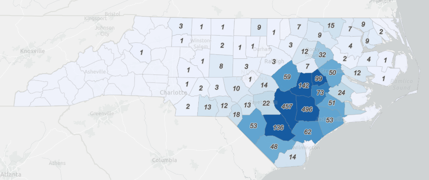
► Map Challenge: Swine Lagoons by County
- Create a map showing each NC county shaded by the number of hog farms it contains (more hog farms = darker shade). Label only the counties with one or more hog farms. The result should appear somewhat similar to the map below:
Tips:
- You may need to make a copy of an existing layer.
- You may need to filter out records.
- Explore various options in the symbology of layers
III. Add a Buffer to Rivers and Streams
In this step you’ll add a 1-mile buffer to rivers and streams throughout North Carolina, so you can see which hog farms are vulnerable to rising floodwaters.
- Activate the Analysis menu, expand the Use proximity toolbox and select Create Buffers.
- Buffer the NC Rivers and Stream layer a distance of 1 mile.
- Dissolve any overlapping buffer polygons.
- Save the result as “**Buffer 1 mile
**" in your **Hog Farm Analysis** folder
In the next step, you’ll identify the swine lagoons located within this buffer zone.
IV. Intersect Swine Lagoons within the Buffer Area
You’re interested in the swine lagoons within the 1-mile buffer. To isolate those lagoons, you’ll use the intersect tool.
- Activate the Analysis menu and search for “Intersect”, the select the “Overlay” tool from the results.
- In the Overlay layers pane, do the following:
- Overlay the NC Swine Lagoons and the Buffer 1 mile result, choosing “Intersect” as the Overlay type.
- For Output geometry, verify Points.
- For Result layer name, type **Endangered lagoons
** and set it to go to your **Hog Farm Analysis** folder. - Click Run Analysis
► Can you think of an alternative way of performing this analysis? One that does not require creating the “Buffer 1 mile” layer.
The resulting map is confusing. By changing symbol colors, unchecking layers, altering the base map, and other changes you can clarify its message - namely, which swine lagoons are within the buffer.
V. Create a scatterplot of swine count per farm for each county
- With the Allowable Swine by County layer selected, click on the Configure Charts button on the right side menu.
- From the Add Chart menu, select Scatterplot.
- Set the X-axis to “
Count of Points” and Y-axis to “Sum of Allow_Count” - Add the linear trend.
- Set the size of the point to be proportional to population density (“
Pop20_Sqmi”). - Change the title and axes:
- Title: Mean swine density of farms
- X-axis: Farms per county
- Y-axis: Total hogs per county
- Set the plot to filter by extent.
VI. Share your findings
Share your map with “Everyone” and include the URL of your map product in your submission.
→ Discussion
- What key assumptions are made in this analysis? How might they affect the results?
- What are some other datasets that might improve the reliability of this analysis? Can you find any of these?
Deliverables:
Within the class Canvas site, under the Test & Quizzes section, find the AGOL Exercise entry. Submit the following in this form:
-
The date the NC Animal Permit Locations data layer was created.
-
The animal waste types included in this data layer.
-
The number of records included in this layer.
-
The URL of your Hog Lagoon map shared with everyone (e.g. http://arcg.is/ujeCm). This map should be zoomed to North Carolina and include:
- NC Swine lagoons (filtered swine points from Animal Operations Permit data set), shown as a single feature type.
- NC Counties (filtered from the Generalized USA county layer), displayed so as not to dominate the map.
- NC Rivers and Streams (filtered from the USA Rivers and Streams dataset).
The map should be saved with the Title, Tags,
and Summarymentioned above. -
The URL of your map showing the number of swine lagoons by county. This map should:
- Be shared with everyone (or just the class group)
- Show NC counties shaded by the number of swine lagoons, and
- Show labels for each county with at least one lagoon indicating the number of lagoons found in the county.
Other layers can appear in the map but should be turned off.
-
The URL of presentation -
Discussion question #1
-
Discussion question #2